
Building a Visual Identity That Empowers Hearts Worldwide
Client:
HeartLife Foundation
Year:
2025
Services:
Brand Strategy, Creative Direction, Rebrand Storytelling, Illustration, Editorial Design
Impact area:
Patient Support / Awareness / Education / Brand Visibility / Community
Challenge
Designing for a Visual Evolution That Puts Life First
After years of working alongside Heart Life Foundation — facilitating creative workshops, designing strategic frameworks, and patient journey mapping, they were ready to reimagine how they shot up in the world. Intending to go global, they needed a complete visual transformation that could shift perceptions — moving away from clinical, fear-based health communication toward a brand that radiates hope, celebrates life, and empowers a growing community of patients, caregivers, and health partners worldwide. The challenge was creating an identity bold enough to stand out in the healthcare space while remaining warm, accessible, and deeply human.
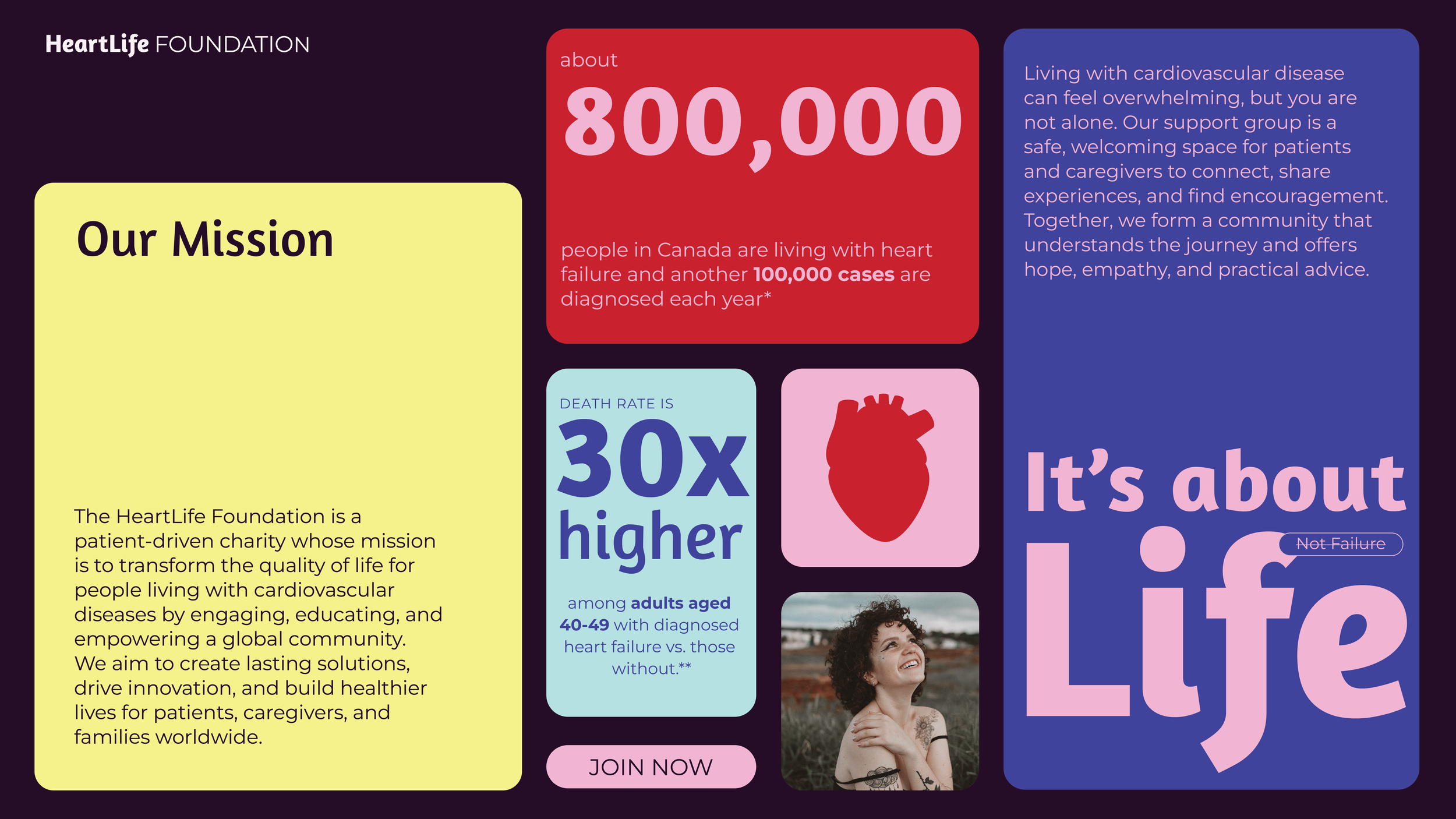
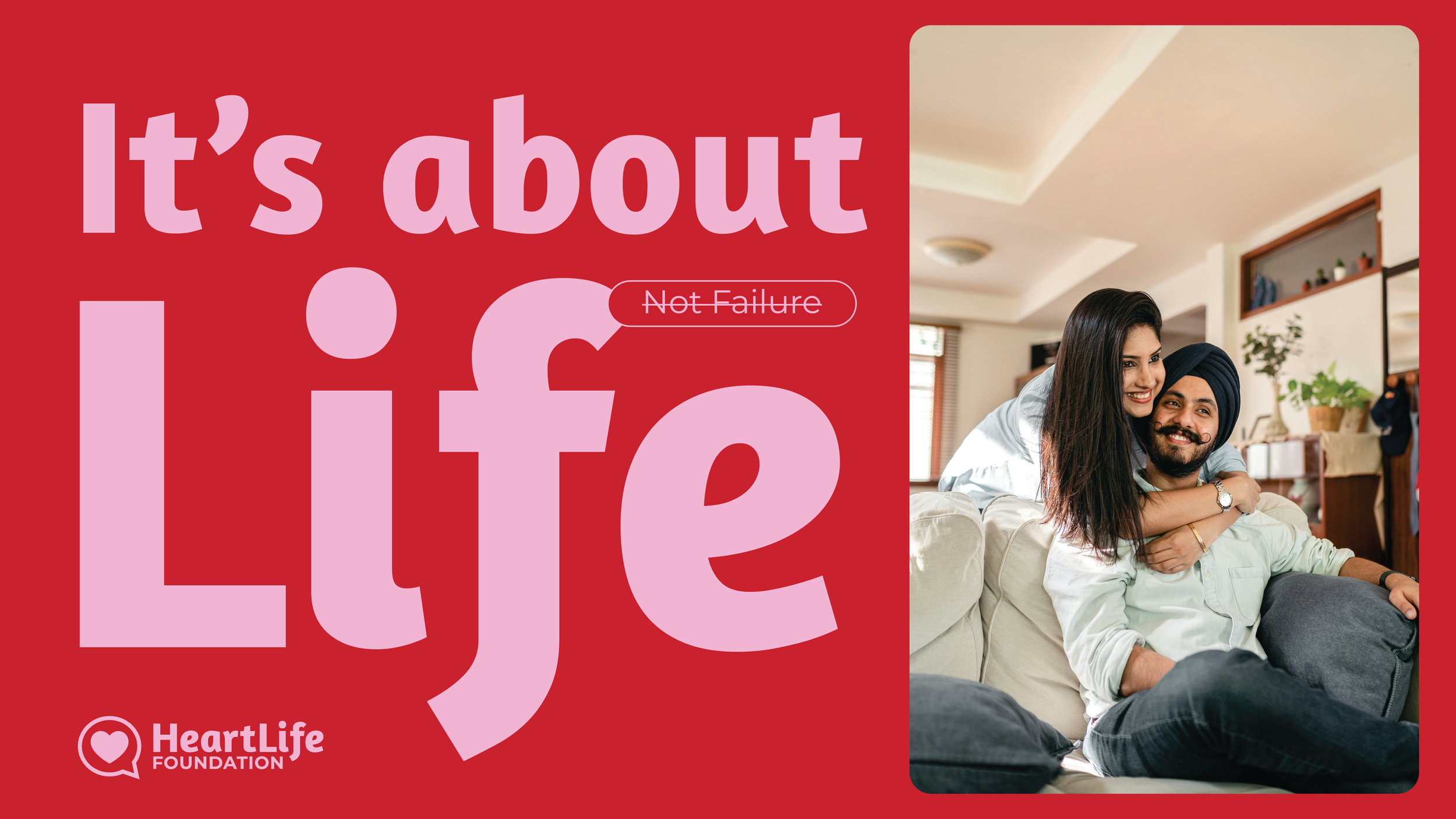
A Design System That Celebrates Life
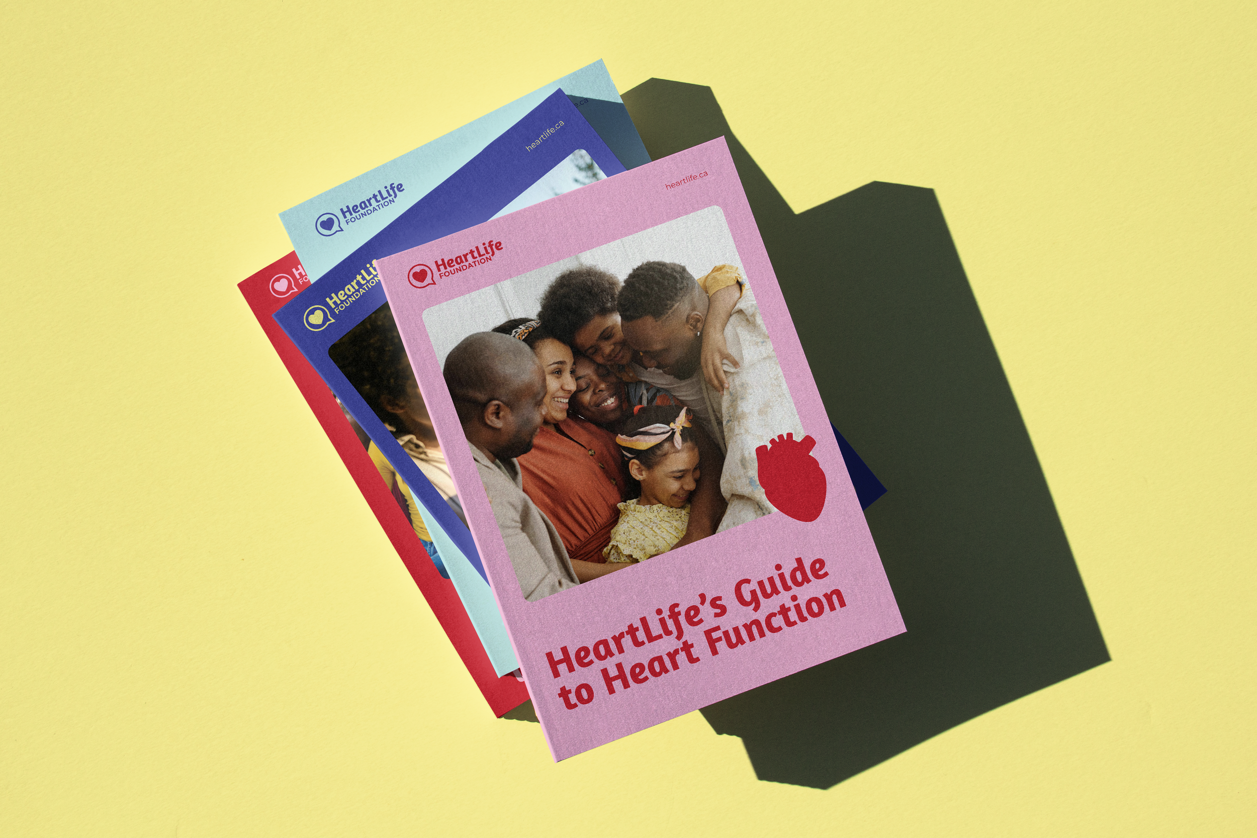
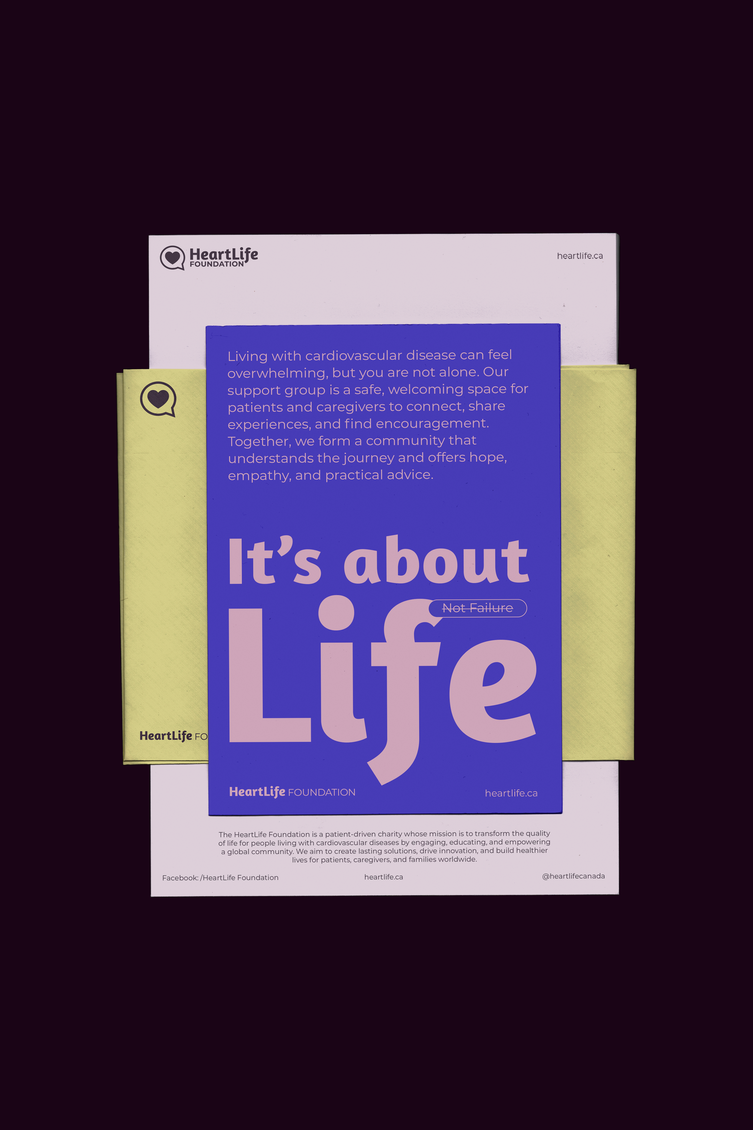
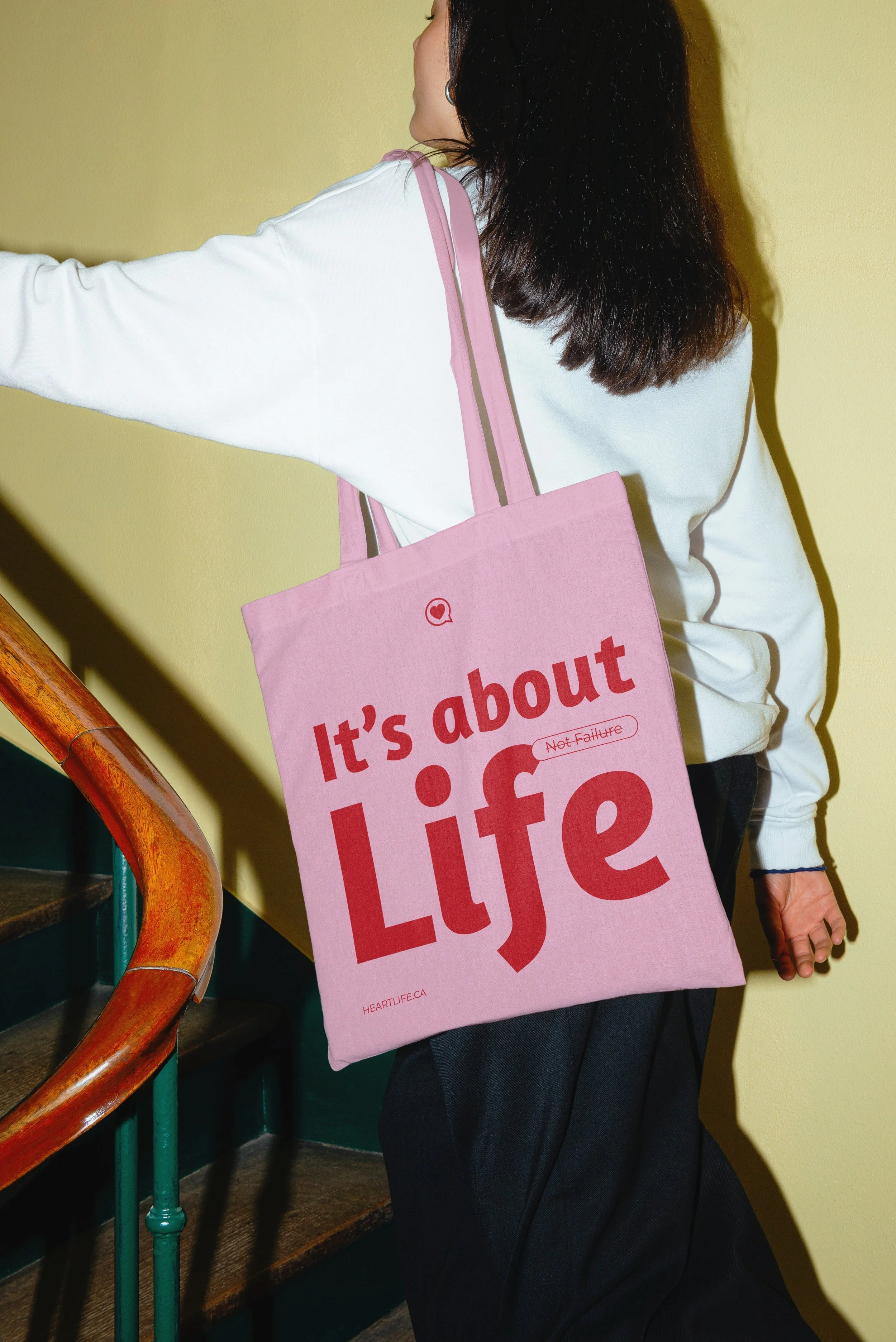
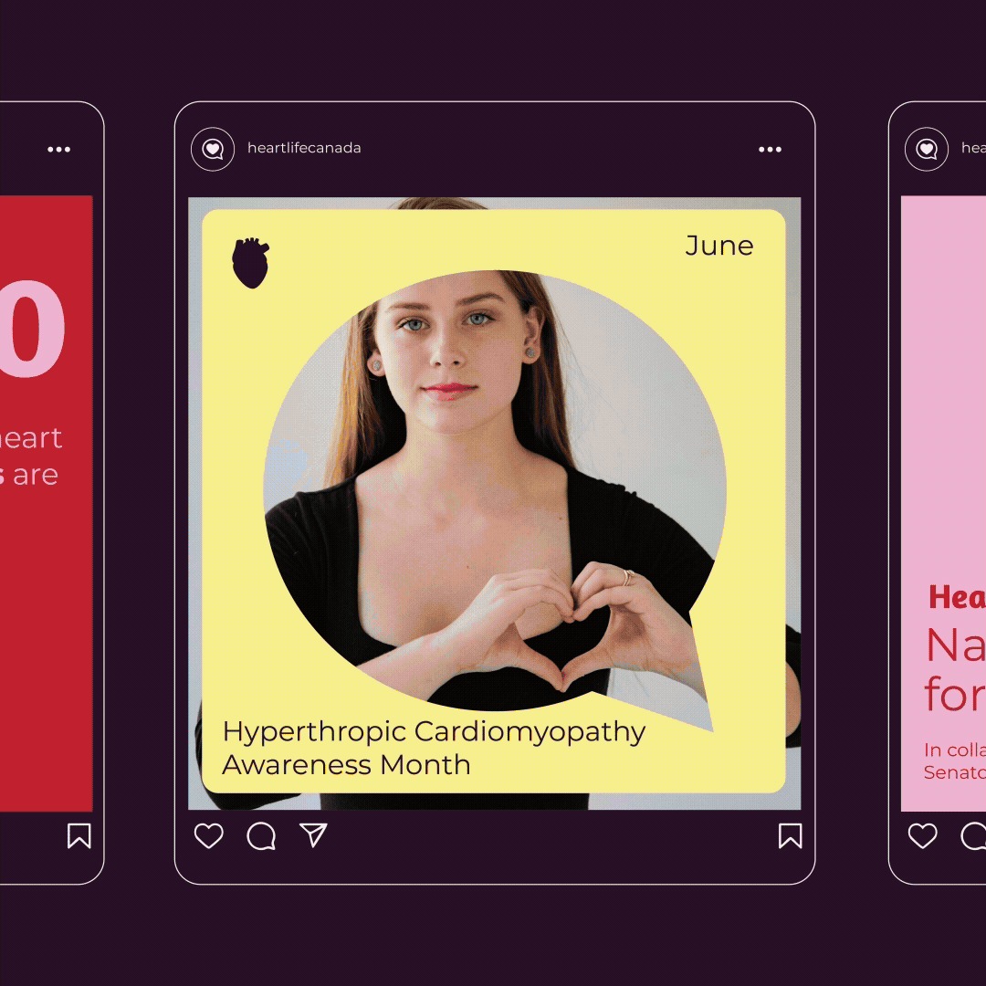
At the heart of the rebrand is a vibrant, life-affirming color palette that breaks away from traditional medical blues and grays. We developed a bold color-blocking system featuring energetic reds, soft pinks, sunny yellows, and rich purples — each hue representing a different facet of living fully with cardiovascular disease. The colors work together harmoniously, creating dynamic visual moments that feel optimistic and inviting. This system allows HeartLife to speak to different audiences and topics while maintaining a cohesive, recognizable presence that says: life doesn't stop after a diagnosis, it flourishes.


Outcome
A Rebrand That Speaks Warmth
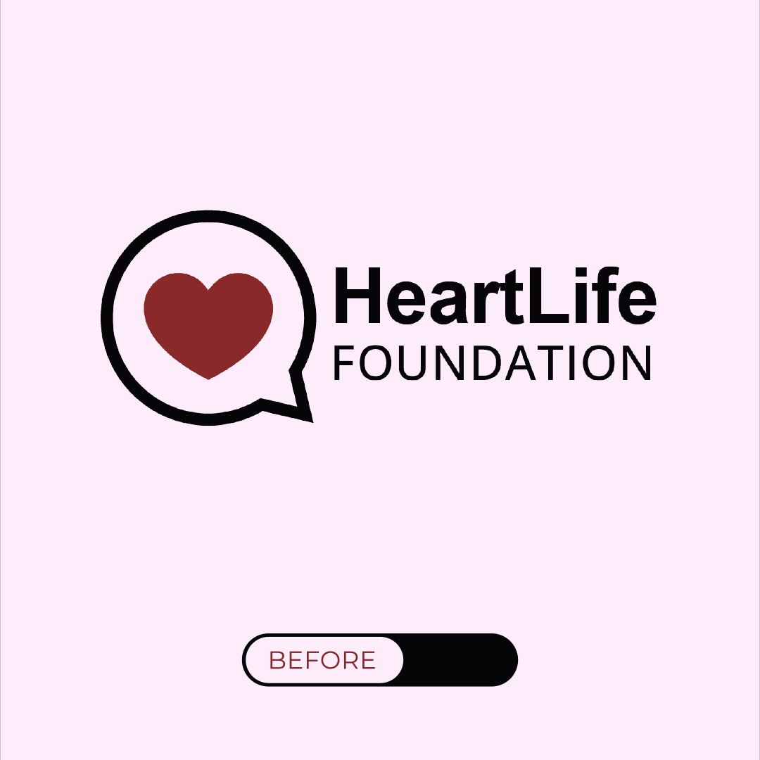
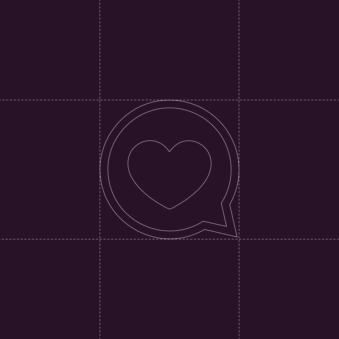
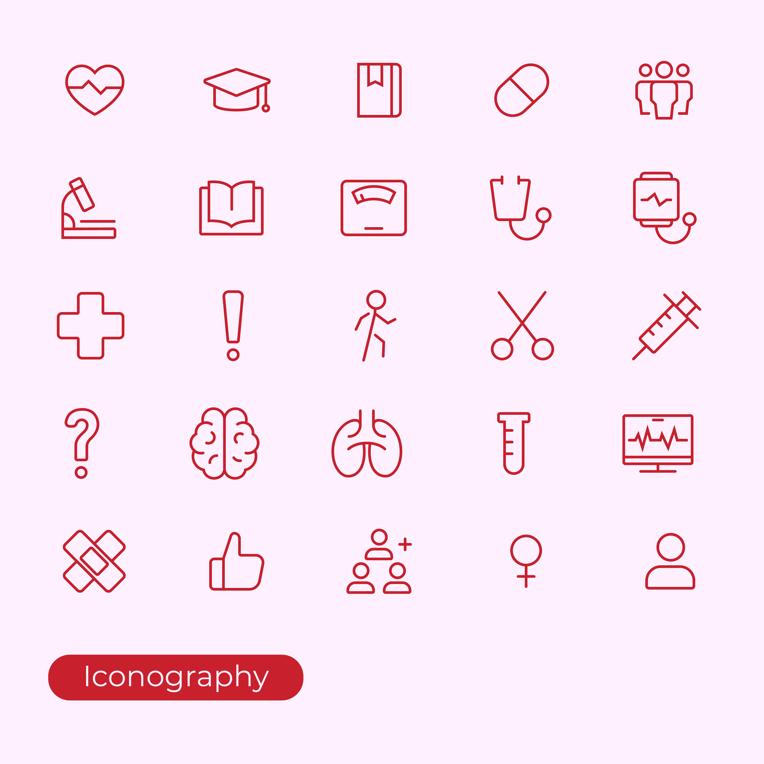
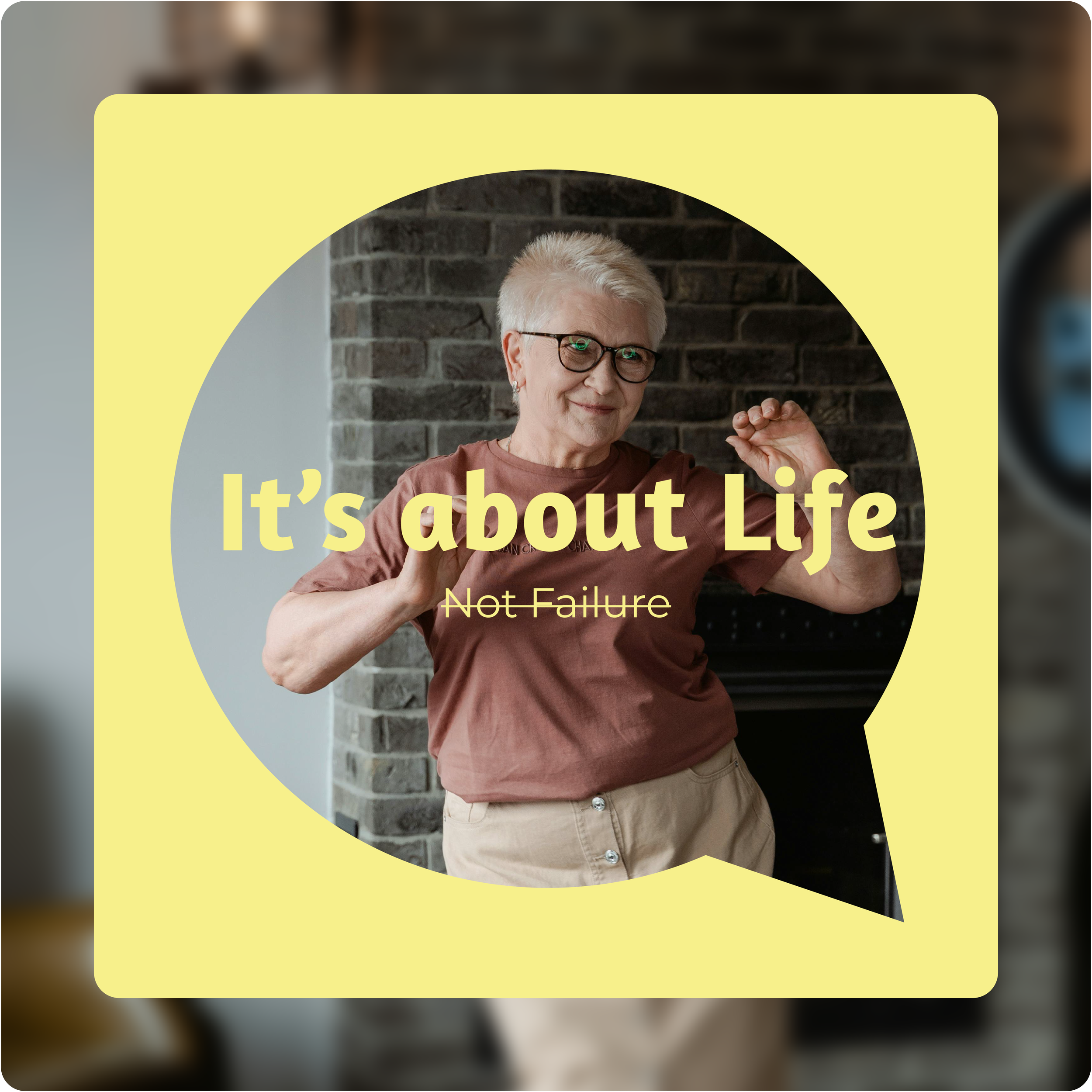
Every element of this rebrand was designed to radiate compassion and human connection. The typography pairs the friendly, rounded Amaranth for headlines with clean sans-serif body copy, creating a visual voice that's professional yet welcoming — never clinical, always compassionate. We created a custom illustration style and icon system that brings this warmth to life, with the heart-in-speech-bubble logo inspiring playful, inclusive illustrations of real connection moments. The simple, friendly illustration system celebrates the diversity of HeartLife's community, showcasing people of all ages and backgrounds living their lives to the fullest.


Like what you see?
Let's create some moves together
you might also like
-
All Vote no Play
-
Nothing is Written in Stone